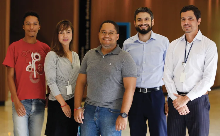
Website of the year: Central Bank of Brazil
New bilingual site offers enhanced communications to full range of stakeholders

The Central Bank of Brazil had two core objectives when it started the process of overhauling its website in 2017: to ensure its technical releases and educational information reached as wide a domestic audience as possible in Brazil, while also offering access to key economic information to foreign stakeholders.

During its last website upgrade, in 2002, the central bank decided only to operate a Portuguese-language site, which had a limited scope. Other than running the whole site through a translator tool and issuing the occasional release in English, the central bank did not effectively communicate a proportion of its website to non-Portuguese speakers. “Our former website was not properly designed to efficiently reach our entire audience,” says Maurício Moura, deputy governor for institutional relations, citizenship and conduct supervision at the Central Bank of Brazil. “We did target foreign stakeholders then, but not all relevant information they sought was available in English as it was in Portuguese.”
These foreign stakeholders are viewed as important decision-makers when it comes to foreign direct and other forms of investment in Brazil. So, in 2017, the country’s central bank decided to change its approach. “It was time to go bilingual,” says Rocha.
Central bank staff first engaged with members of the public and the financial community through an online survey and retested the old site to discover any inefficiencies and at what point within the website people stopped engaging. The central bank then set about redesigning its website. “We had two aims when redesigning the website,” says Moura. “The first was to support the decision-making process of visitors. And the second was to strengthen our international presence.”

The redesign was conducted in tandem with teams working on both the Portuguese and English sites. Unlike other central banks that have redesigned their websites in the past few years, the Central Bank of Brazil did not outsource the work, rather employing members of the bank with specialist skills to rebuild the site. “The Central Bank of Brazil has allocated for this task-specific skilled staff with diverse backgrounds, such as economy, web design and video-making expertise,” says Moura.
One of the biggest changes was to ensure the central bank used more visual tools, including the use of infographics and video. The central bank also chose to display both its inflation rate and benchmark interest rate (the Selic) in graphic form on its home page. Before, only raw data was provided, and users struggled to visualise the progression of both these indicators, says Rocha.
Under the skin
The Brazilian and English language sites are hosted on the same platform, but bespoke content is created for them individually, unlike other multilingual sites that just mirror content. “The website in English is not a direct translation from Portuguese,” says Moura. “It was uniquely designed for foreign users and written originally in English.”
During its research, the central bank discovered most people who delved into the inner layers of the old site were from overseas – potential international investors, businesses or academics. As a result, the initial layers on the English website are more technical.
“For the website in Portuguese, we have invested in plain language and clear infographics when publishing key economic statistics,” says Moura. It is geared towards financial education – a place where members of the public can understand what inflation is and why the central bank now targets an inflation rate of 4%. A similar framework for information display has been deployed for the main headings on the website, including monetary policy.

The central bank has also taken care to ensure the language used can be easily understood, particularly by those with limited technical knowledge. Those that want more detailed information, however, can delve into the deeper levels of the website as every tier becomes seemingly more technical.
The native-language website redesign ties in with the Central Bank of Brazil’s efforts to communicate via social media to members of the public who may previously have been excluded from central bank messaging. “We´ve been heavily investing in our social media interaction,” says Moura. “We are improving our presence on Facebook, Instagram, LinkedIn, Twitter, YouTube and Flickr.”
There is some information, however, which can be found on both sites; monetary policy statements, the inflation report and important meeting minutes are published on both sites, unaltered. One of the issues with the old site was ensuring important, time-sensitive documents were published without a lag.
The redesign ties in with the Central Bank of Brazil’s efforts to communicate via social media to members of the public who may previously have been excluded from central bank messaging
With the new design, the central bank can ensure statements can be published in real time – currently, only the most important documents are published simultaneously on the sites. “The website in English still lacks some content at the moment if compared to the information available in Portuguese”, explains Moura. “We do not have a bilingual team dedicated to this project yet, but we expect to change that soon, reducing this gap.”
Risk assessment
While both of the sites were produced at the same time, the central bank decided to launch the native-language site first. “We did not have the capacity to launch both at the same time, and launching one gave us a chance to address any remaining issues on the other,” says Moura. “Our websites in English and in Portuguese are constantly evolving as we continue to work on providing information and improving the user experience.”
The central bank was able to launch the native site in 2018 with seemingly few issues. Any glitches or feedback the team received, they were able to fix quickly and apply the changes to the English site, which was deployed last year.
The Central Banking Awards were written by Christopher Jeffery, Daniel Hinge, Dan Hardie, Rachael King, Victor Mendez-Barreira, Alice Shen and William Towning
Only users who have a paid subscription or are part of a corporate subscription are able to print or copy content.
To access these options, along with all other subscription benefits, please contact info@centralbanking.com or view our subscription options here: http://subscriptions.centralbanking.com/subscribe
You are currently unable to print this content. Please contact info@centralbanking.com to find out more.
You are currently unable to copy this content. Please contact info@centralbanking.com to find out more.
Copyright Infopro Digital Limited. All rights reserved.
As outlined in our terms and conditions, https://www.infopro-digital.com/terms-and-conditions/subscriptions/ (point 2.4), printing is limited to a single copy.
If you would like to purchase additional rights please email info@centralbanking.com
Copyright Infopro Digital Limited. All rights reserved.
You may share this content using our article tools. As outlined in our terms and conditions, https://www.infopro-digital.com/terms-and-conditions/subscriptions/ (clause 2.4), an Authorised User may only make one copy of the materials for their own personal use. You must also comply with the restrictions in clause 2.5.
If you would like to purchase additional rights please email info@centralbanking.com


