Website of the year: Sveriges Riksbank
Redesign has resulted in users engaging with more content

The Sveriges Riksbank has undergone more change than most central banks in the past decade or so. It has addressed financial stability issues while navigating a complex national framework for prudential responsibility. It was an early adopter of forward guidance. It launched a quantitative easing (QE) programme, cut its policy rate below zero and changed its monetary policy target. It launched new denominations of coins and banknotes and is now exploring the potential launch of digital central bank money (the e-krona).
Each of these changes presents a communication challenge and a test to the relationship between the central bank and its stakeholders. It has met these challenges by speaking plainly, openly and frequently, and by continually adapting its communication tools to ensure its messages are heard. At the heart of this is its website, which has evolved continually throughout this period, and, in doing so, has consistently been at the forefront of the central banking community.
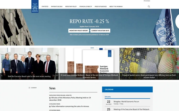
The Riksbank wants its users to be able to find what they are looking for quickly and easily, and the latest redesign of its website, launched in February 2018, was chiefly aimed at making key content easier to access. This is apparent from the simplified home page, which promotes the latest news, forthcoming events and popular content, including information on interest rates, exchange rates and invalid banknotes.
“Our most frequently used functions are those that are interactive and enable users to solve a task directly on the website,” says Anna-Karin Häggström, a web strategist in the communications division at the Riksbank.
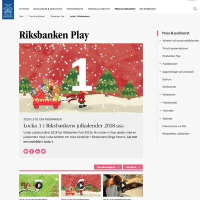
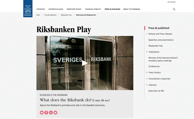
A key feature of the home page is the ability of more irregular but important events, such as monetary policy announcements and subsequent press conferences, to dominate the home page when they occur. This is achieved through the Riksbank’s streamlined broadcasting tool, Riksbanken Play. This function also hosts the central bank’s videos, and is used to disseminate a range of content – including what is perhaps the first-ever central bank advent calendar. There may not have been any chocolate involved, but there was a lot of money behind the first door – almost 20 kilograms’ worth.
The redesign goes deeper than the home page. The Riksbank analysed visitor statistics and undertook a combination of web-based surveys and in-depth interviews with its users to better understand their behaviour. It used the results of these feedback efforts to improve the navigational structure and content of the website.
One of the key conclusions the central bank drew concerned its website menu. The first level was retained, directing users to key information (‘About the Riksbank’), core functions (‘Payments & Cash’, ‘Monetary Policy’ and ‘Financial Stability’) or main outputs (‘Statistics’, ‘Press & Published’). Indeed, where other central banks have perhaps overcomplicated their menus at this stage, the Riksbank’s is simple and efficient.

However, the central bank decided the deeper levels of the menu needed to be restructured. Each of the primary options now leads to a clean webpage offering definitions, data and links to further content that manages to be both accessible to members of the public and useful to more informed stakeholders.
The results of the redesign are clear. “Compared with the old website, visitors stay longer on the website and consume more pages per visit,” says Häggström.
Each time someone visits the site, they are staying on average 50% longer than they were before, while the number of pages viewed in each session has increased by 7%. Moreover, evidence suggests users are increasingly finding what they are looking for, with both an increase in the use of the website’s internal search engine (12%) and the time spent on the website after searching (9%).
Central banks have widely adopted a more minimalistic approach to design based on increasing the number of graphics, reducing the amount of text and promoting interactivity. Some websites combine this with a simple and efficient navigation structure and accessible content. The very best manage to also capture and convey the complexity and nuances of central banking. The Riksbank leads with succinct summaries of its functions and decisions, while ensuring the latest information and more detailed reports are only a click or two away at any point in its navigational structure.
Managing the site has also become easier. Changes to the back end have created a more efficient production-launching process, while reducing the amount of work involved in publishing. “This is essential in order to be able to roll out updates more quickly and to free up time for working on the content,” says Häggström. By improving its processes, the Riksbank is ensuring the website will continue to evolve in the coming years.
As with many other central banks, the Riksbank is also an active user of social media, using it mainly to promote monetary policy decisions, reports and public appearances by its senior policy-makers.
In redesigning its website, the Riksbank has sought to smooth the link between its website and these channels. “We have worked to integrate our digital platforms,” says Häggström. “The website is the base for other digital communication, and via social media, we spread awareness of the Riksbank and our operations.

“The content of the new riksbank.se is therefore better optimised to facilitate its dissemination through social media.”
This was ably demonstrated by content marking the 350-year anniversary of the Riksbank, including a historical timeline marking key moments in its history. As the central bank continues to evolve, so too does its website.
While the central bank will continue working on many facets of its site in the year to come, one of its priorities will be the production and visualisation of data over longer time series – increasingly, a demand across central banks.
The Central Banking Awards were written by Christopher Jeffery, Daniel Hinge, Dan Hardie, Rachael King, Victor Mendez-Barreira, Joel Clark, William Towning and Tristan Carlyle
Only users who have a paid subscription or are part of a corporate subscription are able to print or copy content.
To access these options, along with all other subscription benefits, please contact info@centralbanking.com or view our subscription options here: http://subscriptions.centralbanking.com/subscribe
You are currently unable to print this content. Please contact info@centralbanking.com to find out more.
You are currently unable to copy this content. Please contact info@centralbanking.com to find out more.
Copyright Infopro Digital Limited. All rights reserved.
As outlined in our terms and conditions, https://www.infopro-digital.com/terms-and-conditions/subscriptions/ (point 2.4), printing is limited to a single copy.
If you would like to purchase additional rights please email info@centralbanking.com
Copyright Infopro Digital Limited. All rights reserved.
You may share this content using our article tools. As outlined in our terms and conditions, https://www.infopro-digital.com/terms-and-conditions/subscriptions/ (clause 2.4), an Authorised User may only make one copy of the materials for their own personal use. You must also comply with the restrictions in clause 2.5.
If you would like to purchase additional rights please email info@centralbanking.com


